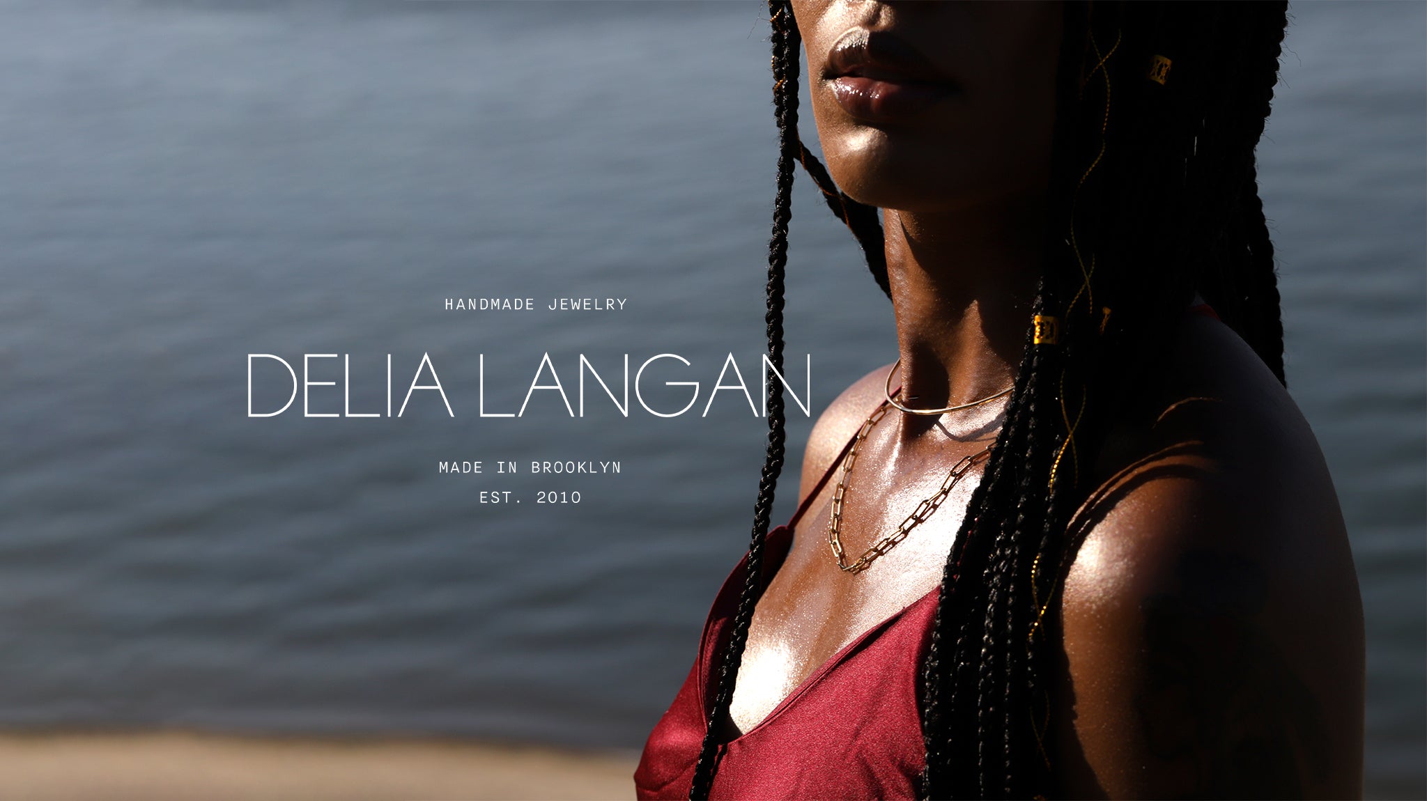
New Branding - Who Dis?
We're SO excited to introduce our complete rebrand.
As we celebrated earlier this year, DLJ is now 10 years old. I started this company very young. I was only 22 when I developed my first logo with my friend Liz. Fresh out of college, tie dye was in, and I was absolutely thrilled with the logo Liz produced for me. It was SUPER bold, colorful, girly, everything I wanted my brand to be at the time. Basically a party in a logo.
![]()
I understandably tired of this rainbow logo (I actually got kind of nauseous looking at it I was so sick of those colors) and changed it to my most recent logo, which was a calmer, blue-only palette. It served me pretty well for several years.
![]()
Obviously a lot changes between the fresh-out-of-college age and being in your 30s. DLJ has grown up, my personal brand has evolved, and I felt like a real change was well overdue. I worked with an amazing designer, Bella Geraci, who held my very-difficult-to-work-with-creatively-hand through the process for several months. She did an AMAZING job. Rebranding your own company is so tough because, let's be honest, your business is your baby and you want it to be perfect. Working with Bella was a breeze and I'm thrilled with the results.

I wanted a logo and color palette that reflects who my brand and I are now, and I feel this finally reflects that. The thin, simple font is classic and clean lined, but can be used in a variety of colors to make it fun, just like my jewelry.
![]()
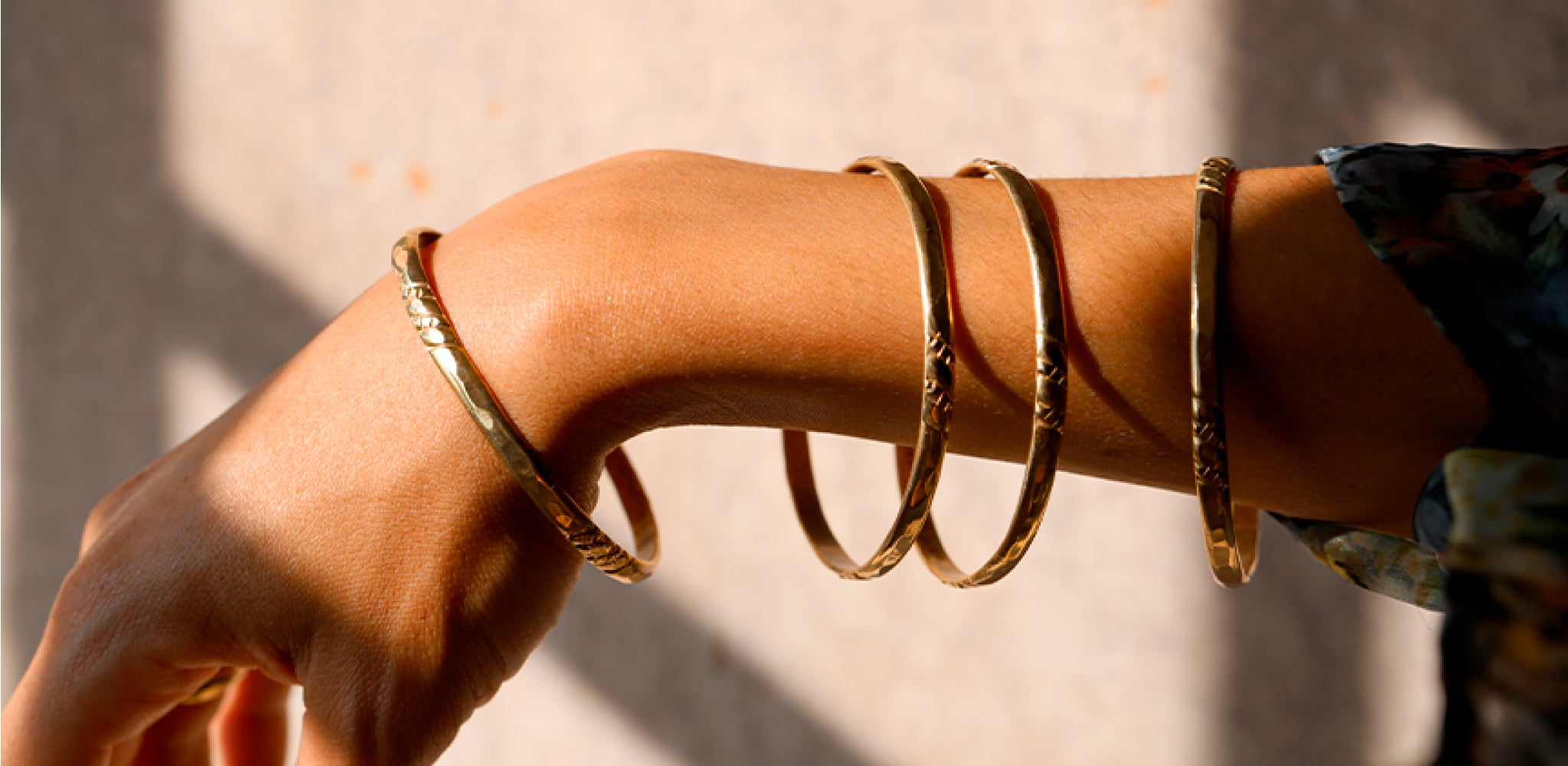
We chose the irregular circle mark because it represents the organic, often irregular shapes I use with my handmade jewelry. The colors were the most difficult process, as I am a color hoarder. I'm not sure if I'll be able to stick with one palette, but I do think the palette I chose is natural and representative of who I am right now.

Though the branding process isn't complete, I couldn't wait to share with you my new logo and font families. I hope you like them as much as I do!
xo
Delia
Written by Delia Langan